The 5-Tier Emissions Data Hierarchy Explained

In short: Not all emissions data is equal. There are five tiers, from least to most reliable: industry averages, spend-based, modelled, activity-based, and direct from source.
The first three are secondary data. The last two are primary data. Spend-based is a fine place to start, but it is a starting point, not a destination.
The goal from day one is to find your highest-emitting sources and move them up the hierarchy toward activity and direct-from-source data, documenting your method as you go.
This article expands the data-quality section of our pillar guide, how to build an emissions data management plan. If you have not set one up yet, start there.
What is the emissions data hierarchy?
The emissions data hierarchy is a simple way of ranking how reliable a given piece of emissions data is, based on where it came from and how it was calculated.
It matters because two organisations can report the same activity and land on very different numbers, purely because of the data they used. A figure built from a broad industry average carries far more uncertainty than one built from a supplier's actual measured emissions. Understanding the hierarchy changes how you treat every source in your inventory, because it tells you which numbers you can defend and which ones need work.
Regulators and assurers are increasingly interested in this. When Purpose Bureau analysed the first wave of Group 1 reports in its Q1 2026 State of the Market report, only 7 percent disclosed any Scope 3 category at all. Almost everyone is early, which means how you handle data quality now will shape how credible your reporting looks later.
What are the five tiers of emissions data?
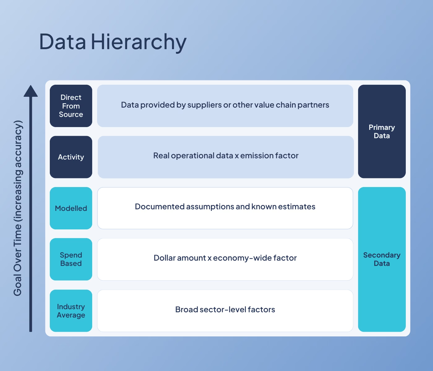
There are five tiers. From the bottom up:
1. Industry averages (secondary)
Broad sector-level factors, used when you have no specific data at all. Better than nothing, but the least accurate tier since these numbers are typically conservative, and the one most likely to attract questions under assurance.
2. Spend-based (secondary)
The most common fallback. You take a dollar amount and apply an economy-wide emission factor. It is quick and it gets you a baseline, but it is a blunt instrument. It reflects what you spent, not what you actually bought or how it was made and moved.
3. Modelled (secondary)
Documented assumptions and known estimates. An engineering estimate, a supplier average, or a figure built from partial data and known ratios. Acceptable, especially early on, as long as the assumption is written down.
4. Activity data (primary)
Real operational data, like distance travelled or litres of fuel, multiplied by an emission factor. In Australia, those factors come from the government's National Greenhouse Accounts Factors. More effort than spend-based, but far more representative of what actually happened.
5. Direct from source (primary)
Actual figures provided by your suppliers or value chain partners, tied to specific activities and real purchases. A logistics provider giving you the actual fuel use for your shipments is a good example. This is the gold standard, and the most defensible number you can put in a disclosure.
The line between tier three and tier four is the line between secondary and primary data. Getting your material sources across that line is the whole game.
Why does spend-based data overstate your emissions?
What it is: Spend-based data works by multiplying a dollar figure by an average emission factor for that category of spend.
The problem is that the dollar figure and the actual emissions often have little to do with each other.
Spend-based example: Flights
The same flight, on the same route, can cost very different amounts depending on when you booked it and who you booked it with. The emissions are almost identical, but the spend is not. So if you calculate flight emissions from what you paid, two identical trips can show up as very different footprints. The spend figure is telling you about airfare pricing, not about carbon.
The real benefit of moving up the hierarchy is not a smaller number, it is an accurate one.
An accurate figure is something you can defend to an auditor, act on with confidence, and stand behind publicly. A number built on spend gives you none of that, however convenient it is to produce.
In practice, better data often does bring your figure down, because industry averages and economy-wide factors are built to be conservative and tend to sit on the high side. So if you have been putting off more rigour because you fear it means a bigger number, the opposite is usually true. But treat that as a bonus, not the goal. Spend-based data can miss in either direction, and a figure that happens to look low is not a good result if it is wrong. An understated number is a hidden liability. It can unravel under assurance, or later when you finally collect the real data.
The aim is to report a number that reflects what your organisation actually did, so that every decision and disclosure you build on top of it holds up.
When is modelled data acceptable, and how do you make it auditable?
Modelled data sits in middle ground. You do not have the primary activity figure yet, so you build an estimate from what you do know.
Modelled data example: Waste
Most waste invoices are based on bin lifts, not on how full the bin actually was. A common approach is to assume each bin is 80 percent full and model the volume from there. That is a modelled assumption, and it is perfectly acceptable in an early reporting period.
What makes it auditable is documentation. An assurer is not expecting perfection. They are expecting you to show your working.
For any modelled figure, record three things:
- What you assumed;
- Why you assumed it; and,
- Where the assumption came from.
If you can point to that for every estimate in your inventory, modelled data will hold up. If you cannot, it will not.
How do you move a source up the hierarchy?
Moving up the hierarchy is usually less work than people expect, because the better data is often already sitting in a system somewhere.
Here are four common sources and how to lift each one.
The pattern across all four is the same. The activity data usually exists. Moving up is often a matter of changing an internal process or asking a supplier, not launching a huge project.
Which sources should you prioritise?
You do not move everything up at once, and you should not try to. Prioritise by materiality.
For most organisations, the material Scope 3 sources to look at first are travel, freight, and waste. They tend to be significant, and, as above, they are often the easiest to improve because the better data is within reach. Start there.
The other habit worth building is asking suppliers. You would be surprised how much information you can get when you ask, particularly on travel, freight, and waste. A waste provider that sends you a basic invoice will often have a system that can export exactly the data you need. The information is there. Most organisations just have not asked for it yet.
This is also where a common question comes up:
"We are using spend-based for pretty much our entire Scope 3. What is the most practical first step?"
The answer is not to redo everything. It is to look at your material sources, check whether activity data is available for them, and move those first. Your emissions data management plan makes this obvious, because it shows where your material emissions sit and what data you can access for each one.
Ready to map your sources by tier? Download our free Emissions Data Management Plan template and record the data tier and method for every source in one place.
How do you document data quality for assurance?
The hierarchy is not just a tool for improving accuracy. It is a tool for demonstrating diligence, which is what assurance is really testing.
For every source, your data management plan should record which tier the data currently sits in and how you calculated it. That gives an assurer a clear, honest picture: here is what we have, here is how good it is, and here is our plan to improve the material gaps.
What auditors want to see is exactly that, a plan for moving up the hierarchy and a clear view of where the gaps lie. They are not expecting every number to be primary data in year one. They are expecting you to know the quality of each number and to be deliberate about it. We go deeper on this in our article on documenting methodology for assurance.
Two proposed changes to the GHG Protocol's Corporate Value Chain (Scope 3) Standard are worth watching here, though neither is finalised or law yet.
- The first would require organisations to report at least 95 percent of their total Scope 3 emissions, leaving only 5 percent excludable.
- The second would require you to disaggregate your Scope 3 emissions by data tier within each category. Instead of one total for a category like purchased goods and services, you would show what share came from supplier-specific data, what share from activity data, what share from spend-based data, and so on. If that comes in, the quality of your data stops being something you can bury in a total. Building the habit of tracking data tier now will put you ahead of it.
Where does software and AI fit in?
Once your data is structured, software makes it easier to manage, and integrations can automate some of the flow. At Climate Zero, for example, our purchased goods and services integration pulls that data through automatically. It is worth being clear that this is spend-based. It gets you a baseline and a starting point, not a shortcut up the hierarchy.
The same honesty applies to AI. AI can help with categorising line items and flagging anomalies. It cannot collect clean activity data from your operations for you, and it cannot tell you whether the source data you started with was sound.
Moving a source up the hierarchy is a human decision about where to look and what to ask for.
FAQ
What is the emissions data hierarchy? It is a five-tier ranking of how reliable emissions data is, based on its source and calculation method: industry averages, spend-based, modelled, activity-based, and direct from source. The first three are secondary data, the last two are primary data. Higher tiers are more accurate and more defensible under assurance.
Is spend-based data allowed for reporting? Yes. Spend-based data is a legitimate starting point and gives you a usable baseline. It should not be your permanent method for material sources, because it reflects what you spent rather than what you actually did, and it tends to inflate emissions. The goal is to move your material sources up to activity or direct-from-source data over time.
What is the difference between activity-based and spend-based data? Spend-based data multiplies a dollar amount by an average emission factor. Activity-based data uses the real operational figure, such as distance travelled or litres of fuel, multiplied by an emission factor. Activity data reflects what actually happened, so it is more accurate and usually lower.
Does better data increase or decrease my footprint? It usually decreases it. Secondary data like industry averages and spend-based factors tends to be conservative and inflated, so replacing it with real activity data often brings the number down as well as making it more defensible.
How do I make modelled or estimated data auditable? Document the assumption. For every modelled figure, record what you assumed, why, and the source of the assumption. An assurer does not expect perfect data early on, but they do expect you to show your working.
Ready to map your sources by tier? Download our free Emissions Data Management Plan template below

Download our template
Explore resources
.avif)

%20(1).png)
Subscribe for updates
We’ll send you helpful articles and resources to keep you up to date.
Ready to make carbon accounting and compliance easier?